Milestone Projects - Object Design 310
For my first definition I wanted to create a rainbow as I found the colour gradient portion of the tutorials we went through the most interesting to me. I liked that I could assign a colour change to a range of numbers and wanted to do it in a basic way. I couldn't quite figure out how to pull it off at the time though as the colour gradient would disappear from my object once I tried rendering it.
2.) Animation
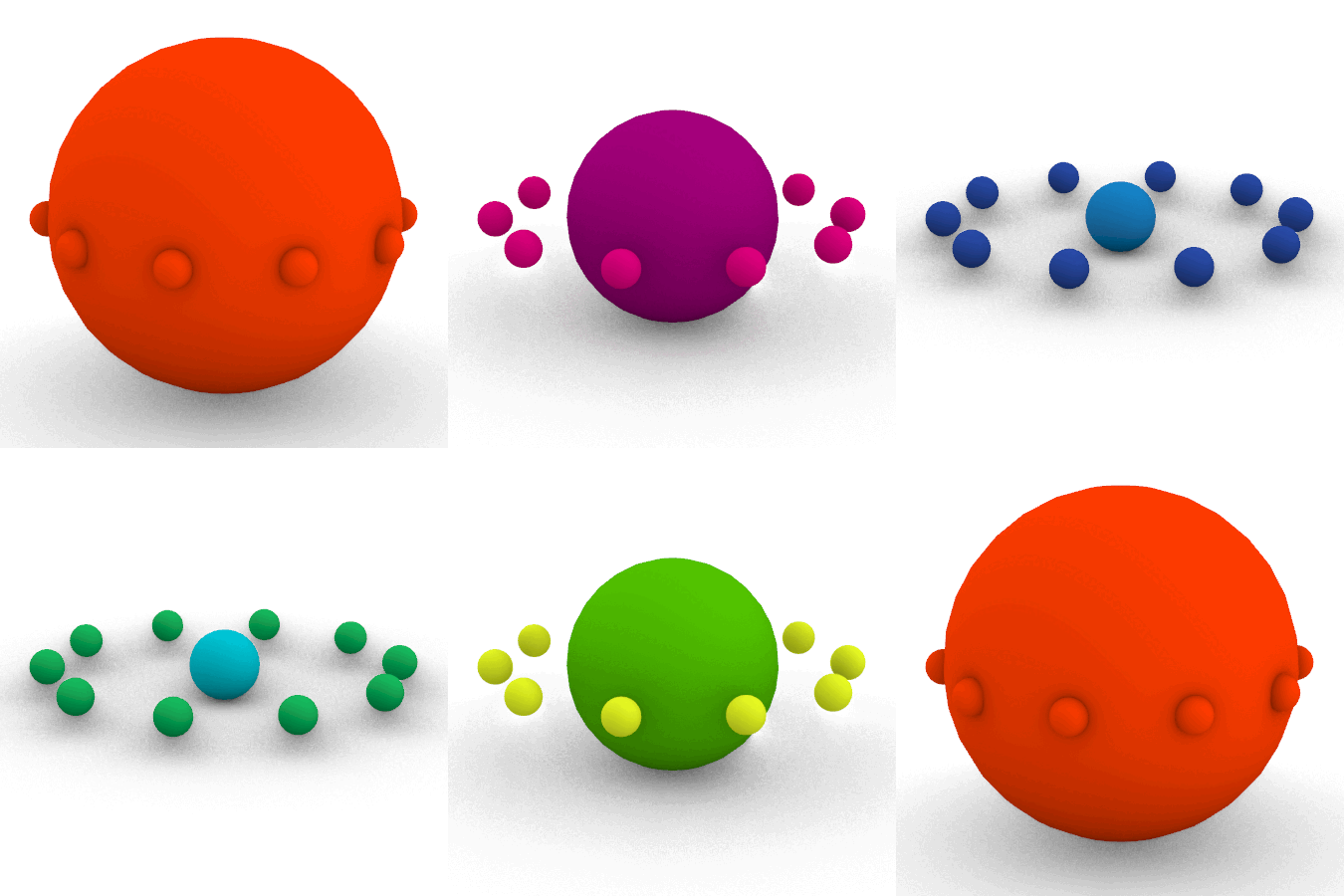
Continuing with my interest in the colour gradient I decided to create a looping gif inspired by videos I had seen of marbles endlessly tumbling through devices and environments. My main focus was the colour changes but I practiced the list management that we had learned in class to give the spheres a fun sense of motion.
3.) Stacked Slices Model
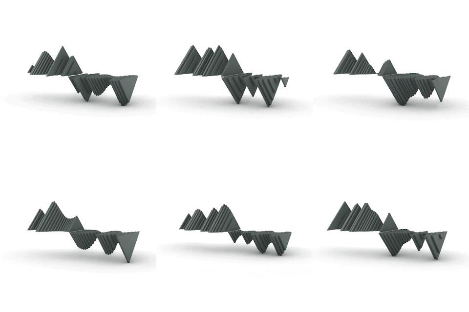
For my stacked slice model I decided to go with a design that was inspired by our exploration of the randomizer slider. The waves of the interpolated line reminded me of both a soundwave and the peaks and valleys of a topographical map. By combining those ideas I began to design a table that would have slotted space for vinyl records as well as a flat surface for a record player. It was fun working with the ranges and visualizing a prototype for a larger project, and having done this I learned a lot about what I would need to modify and account for in future iterations. Primarily the stand I had 3D printed was not strong enough to withstand the weight of the acrylic that I had laser cut for the mountain/sea range. If I were to progress further with this idea, I think I would employ the use of the CNC machine to achieve my final product.
4.) Replicate/Remediate


Comments
Post a Comment